


For my first two seasons of club racing I learned where I had lost time by reading a printout in the paddock an hour after the session ended. The transponder recorded my laps, somebody printed them on a sheet, and by the time I understood that I had been slow through the back esses, the track had gone cold and the day was over. Timing screens exist so that nobody has to wait like that, and the Formula 1 version gives you more information than the commentary will ever use.
The problem is that most of it looks like decoration. Purple numbers, green numbers, two columns of gaps that seem to show the same thing, and a figure for a lap nobody drove. All of it means something specific, and three of those things explain most of what happens in a qualifying session before the lap times appear.
Three sectors and a lot of smaller ones
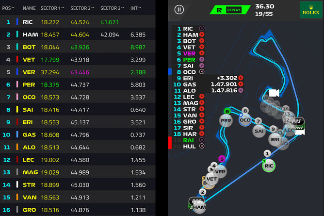
Three timed sections make up every circuit, numbered in the order a driver meets them. The first normally starts at the line and runs through the opening corners. The second owns the middle of the lap. The third brings the car home. Lengths differ, and so do the boundaries, set once per circuit and used nowhere else. Comparing a sector time at Monza with one at Monaco therefore tells you nothing at all.
Underneath run dozens more, the mini-sectors, sometimes called marshalling sectors. They refresh several times inside a single sector instead of once at the end, which pins down the exact corners where a driver gains or loses. Broadcasts mostly show the three. Live timing shows a lap assembling itself piece by piece.
What the colors actually mean
| Color | What it means |
|---|---|
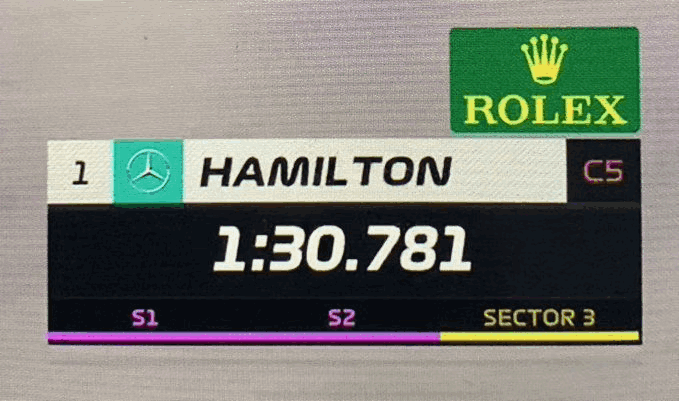
| Purple | The fastest time anyone has set in that sector or lap this session |
| Green | That driver's personal best for the sector or lap, but not the session best |
| Yellow | Slower than that driver's own best in the sector |
| White | A completed time with no benchmark attached yet |
| Blue, on mini-sectors | Pit entry or pit exit segments |
| Red, on mini-sectors | A car stopped on track or an accident |
Color conventions used by the official live timing and by most third-party trackers, checked in October 2026.
Colors change without any time changing. A driver who holds purple in sector two keeps that exact time all session, but the moment somebody goes quicker, the display drops him to green. Nothing he did got worse. The benchmark moved. This is the single most misread thing on a timing screen, because a car dropping from purple to green looks like a car losing pace when it has simply been passed by somebody else’s lap.
A lap time follows the same logic. Purple means the fastest lap of the session, green means that driver’s personal best, and a driver can run three green sectors and take pole without a single purple anywhere. That happened at Monza this year, where the pole lap was set with three personal bests while three other drivers held one purple sector each.
Gap, interval, and the lap nobody drove
| Column | What it tells you |
|---|---|
| GAP | Time to the leader of the session |
| INTERVAL | Time to the car immediately ahead in the order |
| Last lap | The most recent completed lap, colored against the same benchmarks |
| Best lap | The driver's fastest lap so far, purple if it leads the session |
| Sectors 1, 2, 3 | The current lap split times as they arrive |
| Theoretical best | The fastest sectors of the session added together, regardless of who set them |
Standard columns on the official timing tower. During a live session every value is provisional and recalculates as cars cross the lines.
Then comes the theoretical best, also called the ideal lap. Add up the fastest sector times of the session, whoever set them and whenever, and you have it. At Monza that sum reached 1:21.456 and nobody drove it, which happens almost every weekend. What the number measures is the time the circuit had available that day, not a target anybody expects to reach.
That column also carries a 2026 detail worth knowing. A car within a second of the one ahead at the activation point gets manual override, which makes an interval drifting toward 1.000 a number to follow.
Where the numbers live
| Where to watch | Detail |
|---|---|
| The official F1 app | Live timing through the subscription service, the same feed the broadcast uses |
| F1 TV | Timing alongside onboard feeds during a session |
| Independent trackers | Several present the same underlying data with different layouts, some with mini-sector maps |
| After the session | Archived timing lets you rewind a lap and watch it build sector by sector |
Options as available in October 2026. Availability of the official service varies by country.
The sector colors are worth watching before the lap times, because they arrive first. By the time a lap time appears on screen, anybody reading sectors has known the answer for about twenty seconds.
Reading pace rather than position
Three patterns cover most of it. Purple in one sector and yellow in another points to a car that works in one part of the circuit and not another, which is a setup compromise far more often than a mistake. A driver going green everywhere is improving with the track as rubber goes down, which happens to everybody in a dry session and tells you less than it appears to. And a driver whose interval shrinks for several laps with consistent sector colors is genuinely catching the car ahead, while one whose interval shrinks for a single lap has probably just been handed a slow sector by somebody else.
My printout in the paddock could not do any of that. It told me where I had been slow once the information was useless. Nobody reading these screens has that luxury. They find out while it still matters, and then have about forty seconds to decide what to do about it.
What readers ask about F1 timing
That the driver has just set the fastest time anyone has managed through that sector in the session. The benchmark is the whole field, not that driver’s own laps.
Gap is the time to the leader. Interval is the time to the car immediately ahead in the running order, so a driver can be a long way off the leader and very close to the car in front.
A personal best for that driver in that sector or lap. Green and purple answer different questions: one is about the driver, the other about the session.
Because somebody else went faster. The time has not changed, only the benchmark, and a car dropping from purple to green has not lost any pace.
The fastest sector times of the session added together, whoever set them. It shows what the circuit had available rather than a time anybody expects to drive.
Jake Holloway is a club racer, track-day instructor, and motorsports editor based near Charlotte, North Carolina. He has raced karts, Legends cars, Spec Miatas, and amateur endurance cars, and he writes for GreenyCars about how racing actually works, from the rule book to the pit lane.
More Stories
The Dakar Rally and Why Finishing It Counts as Winning
The Ten Greatest F1 Drivers, Ranked by a Club Racer
The F1 Circuits Every Fan Should Know, and What Each One Is For
The F1 Races That Stayed Unsettled Until the End
F1 Driver Nicknames, the Professor to Mr. Saturday